Hola Barcelona
A Ticket Kiosk System Design
Problem
The current TMB ticket kiosks found in Barcelona’s metro stations have an interface that is difficult to navigate, inefficient, confusing, and has an extremely outdated design. This issue results in confused and frustrated tourists and locals - creating issues around navigating the transportation system in a city that is otherwise really easy to get around.
Solution
A self-service interface that provides a clear and efficient process of purchasing transportation tickets so that tourists can navigate the city of Barcelona with as minimal external support as possible.
DISCOVER
What do I know about the existing ticket kiosk interface?
-
Confusing Language & Options
-
Disorganized Information Architecture
-
Disorientating Layout
-
Ugly and Outdated Design
-
Lack of Supporting Features
-
Delayed and Unclear Feedback
-
Non-Inclusive Accessibility
What do I wonder about it?
-
What issues do tourists and locals have with the ticket kiosk?
-
What helpful features can be added to the interface?
-
What do the ticket kiosk interfaces look like in other major cities?
-
What languages would be beneficial to add to the interface?
What did I learn from my preliminary research?
-
Ticket kiosks can be frustrating to customers and need to be substituted as technology evolves.
-
Ticket kiosks don’t need to be staffed as they should be able to clearly guide the user.
-
The purpose of having kiosks is to reduce the burden on service staff - In Barcelona, this purpose is defeated by their difficulty of use.
-
Ticket ki in Barcelona are crowded with tourists as they try to navigate the interface, forcing locals to wait in line longer than expected and causing frustrations.
Commuters:
-
Would like to know hours the train runs.
-
Would like to know what zones mean.
-
Don’t understand ticket prices.
-
Don’t know what areas the metro covers and what it doesn’t.
-
Claim the transfer system is confusing.
-
Report that when you buy ticket online, you still need to use the machine to print the ticket.
How Might We?
HMW make the interface easily interactive for users with different abilities?
HMW better inform the user of their ticket options and how to use them?
HMW minimize the amount of help asked from transportation staff?
HMW make the use of the ticket kiosks more independent?
HMW better inform new users about the different transportation services, since there are multiple operators? TMB, FGC, TRAM, Rodalies
HMW make the language used in the interface easier to understand?
HMW speed up the process of purchasing tickets from the kiosk?
User Interviews
Down at Placa de Catalunya - a well known public transportation station in Barcelona that is usually bustling with tourists and everyday commuters- to observe how people use the ticket kiosks and talk to them to better understand their needs.


Interview Findings
These machines are so unclear. It's not just about how to get the ticket but what is the ticket for...
"
They fined me 50 euros because I landed in zone 3 with a zone 1 ticket - I didn't know I was in zone 3...
"
There are so many tickets and I don't know what they are, how am I supposed to choose what I need?..
"
MARCO
ANA
ZAINEB
DEFINE
Heuristic Analysis
1
2
3
4
5
Visibility
of System Status
Match Between System & Real World
User Control & Freedom
Consistency & Standards
Error Prevention
1
2
3
3
3
-
Difficult to recognize when changes have been made and buttons have been pushed.
-
Feedback is minimal and unclear.
-
Unclear when it is time to pay
-
Ticket types are displayed as images of the real-life tickets, where the information printed is unclear.
-
Instructions are straightforward but minimal.
-
More information is needed to define certain words like “zones”, “T-casual”, “T-usual”, “online collection” and “more need”.
-
No option to go back, only to cancel and return to home screen.
-
Can easily add or subtract tickets
-
Difficult to differentiate between certain ticket types that appear to be the same.
-
“Price” and “more need” at the checkout appear to display the same information. The latter’s meaning is unclear.
-
Easy to make errors as status changes are unclear when selecting number of tickets and zones.
Recognition Rather than Recall
4
-
Image of ticket appears in every screen after selecting ticket type.
-
Number of tickets selected appears at the end purchase screen, however vaguely.
Flexibility & Efficiency of Use
2
-
All ticket types are displayed together and equally, however there are certain types that are most frequently selected by users. Unnecessary time is taken to search for these tickets.
Aesthetic & Minimalist Design
1
-
Outdated and ugly design.
-
Terrible hierarchy of information.
-
Disorganized and disorientating layout.
-
Unnecessary placement of elements like use of red text over grey background and titles placed on top of images.
Help & Documentation
1
-
No help is provided. If user is unsure, they must resort to transportation staff for assistance.
Benchmarking

Stockholm
Edmonton
Vienna
Madrid
Doha
Tokyo
Using a list of characteristics, I have searched interface designs used in ticket kiosks across the world and evaluated their best and worst practices.
-
Comprehension
-
Navigation
-
Design
-
Features
-
Efficiency
-
Accessibility
What Works Well
-
Audio and visual accessibility options
-
Use of infographics & imagery
-
Attention to hierarchy
-
Color coding
-
Options to view more info
-
Map feature
-
Freedom of choice
-
Different search options
-
Multiple ticket types in one purchase
-
Validation on calendar
To Avoid
-
Excessive information on one screen
-
Many options at the start of the process
-
Same button style for all options
-
Thin text on dark background
-
Displaying ticket without description
-
Displaying similar ticket types without differentiating
-
Presenting tasks without prompt
-
Assuming the user knows what to do
Personas

GOALS
BIO
Hedi Saqqaf
NEEDS
“I brought my wife and kids to Barcelona on vacation - I would like to find the easiest way possible to navigate this city within one week.”
Hedi is taking his wife and three children to Barcelona for their summer vacation. He does not know anyone who has been to the city to ask for tips about where to go and how.
-
To see as much of the city as possible in one week.
-
To learn about the must-see attractions.
-
To create a comfortable and fun vacation for his wife and kids.
-
To reach their desired destinations in the most convenient way.
-
To avoid over-spending and take advantage of cost-effective options.
-
A reliable source for their transportation needs to avoid asking for additional assistance.
AGE
LANGUAGE
NATIONALITY
OCCUPATION
STATUS
43
Arabic
Sudanese
School Principal
Married with 3 kids
PAIN
POINTS
-
Spends too much time trying to figure out how to use the ticket kiosk.
-
Does not understand what the different ticket options are.
-
Cannot rely on transportation staff - they speak only Spanish or Catalan.
GOALS
BIO
NEEDS
PAIN
POINTS

Helma Höfler
“I have signed up for a class here in Barcelona. How can I find the cheapest way possible to get around the city?”
AGE
LANGUAGE
NATIONALITY
OCCUPATION
STATUS
28
German
German
Student
Single
Helma has come to Barcelona for a mid-term stay to complete a three month class. She has found a job as a German tutor to pay her tuition, and has started going to a Spanish language class on weekends.
-
To get comfortable with living in the city alone.
-
To get out of the metropolitan city every now and then and explore the areas around.
-
To find an affordable transportation pass.
-
To navigate the city the most efficient way possible.
-
Easy transfer between different modes of transportation.
-
Does not understand what zones are.
-
Has to search online to understand how to purchase a ticket for the metro.
-
Speaks only German and a little bit of English.
-
Has a difficult time navigating the language - there is no German option.
Interface Map

User Flow

IDEATE
Sketches


Low-Fidelity

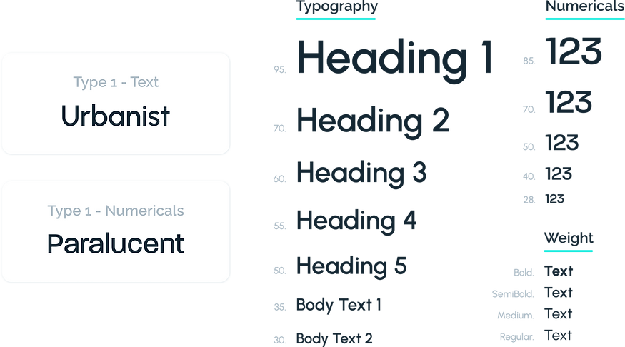
Style Guide - Type

Style Guide - Color

UI Elements - Buttons

UI Elements - Icons
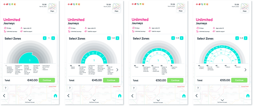
High-Fidelity


